Global Warming through Hand Embroidery
Temproidery—Temperatures with Embroidery
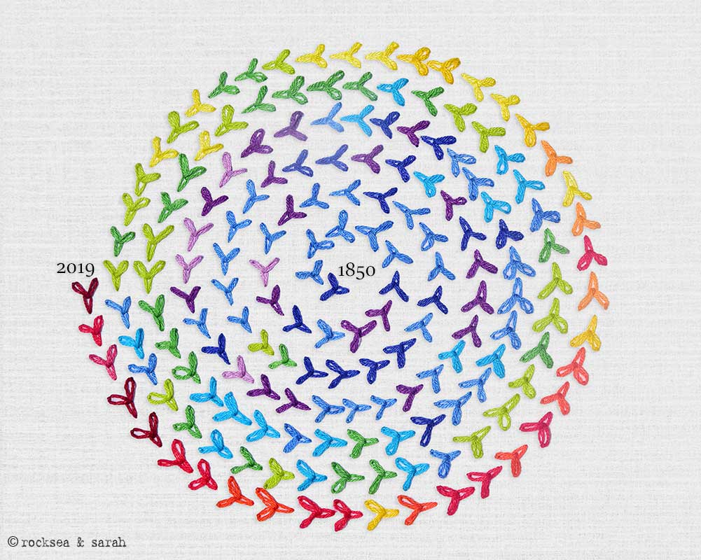
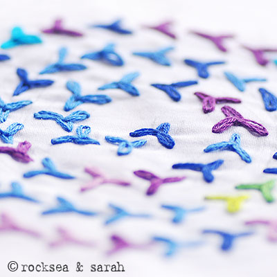
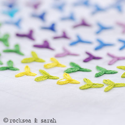
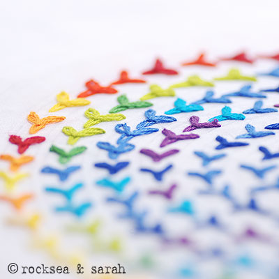
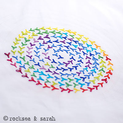
Our Earth has been heating up rapidly in the last 100 years, and nothing can explain it better than the anomaly chart. This embroidery shows how our Earth’s temperature is spiraling away from our hands. In this lesson, I will illustrate how to use the anomalies in temperature since 1850 (that is almost 170 years!) in embroidery. This data was obtained from NOAA (US National Oceanic and Atmospheric Administration).
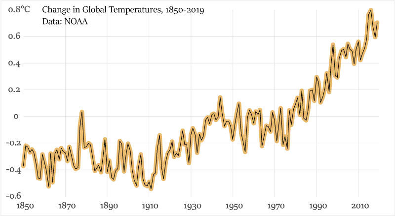
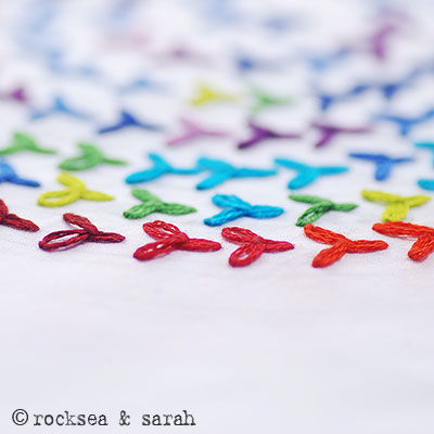
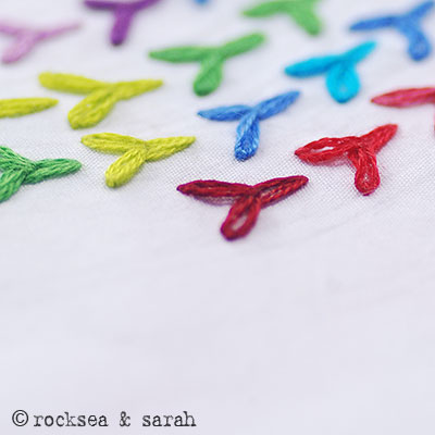
I have chosen 14 colors to represent each range of anomaly. Here is how I arranged them. You can make your own sensible color codes to use for stitching. An anomaly range of 1.4 Degrees Celsius was recorded till date—that is how much our Earth’s temperature has changed since 1850 (mean change is 0.9°C). So, I decided to assign a color for a difference of 0.1 Degree Celsius. Usually, the anomaly chart uses red and blue colors, but I thought I should include green and yellow as well, to give the entire pattern a vivid and bright feel.
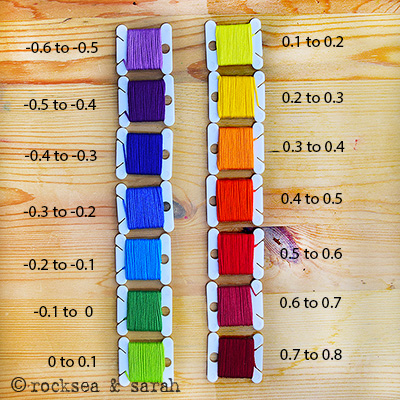
Then, I had to decide on a stitch to use. Each stitch would represent a year and will be stitched in the color that represents the range of anomaly for that particular year.
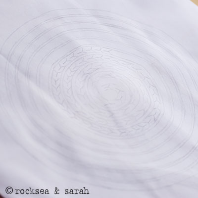
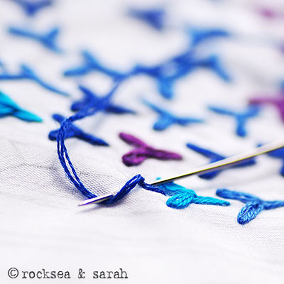
Sarah’s Hand Embroidery

PROFILE
Juby Aleyas Koll, also know as Sarah, is the author and publisher of the book and website Sarah’s Hand Embroidery Tutorials. She has been researching and tutoring hand embroidery for over a decade, making it accessible to everyone around the globe.
Hand Embroidery Stitch Lessons with step by step Illustrations, Patterns, Projects and a bit of History.
450+ Lessons since 2008.

